

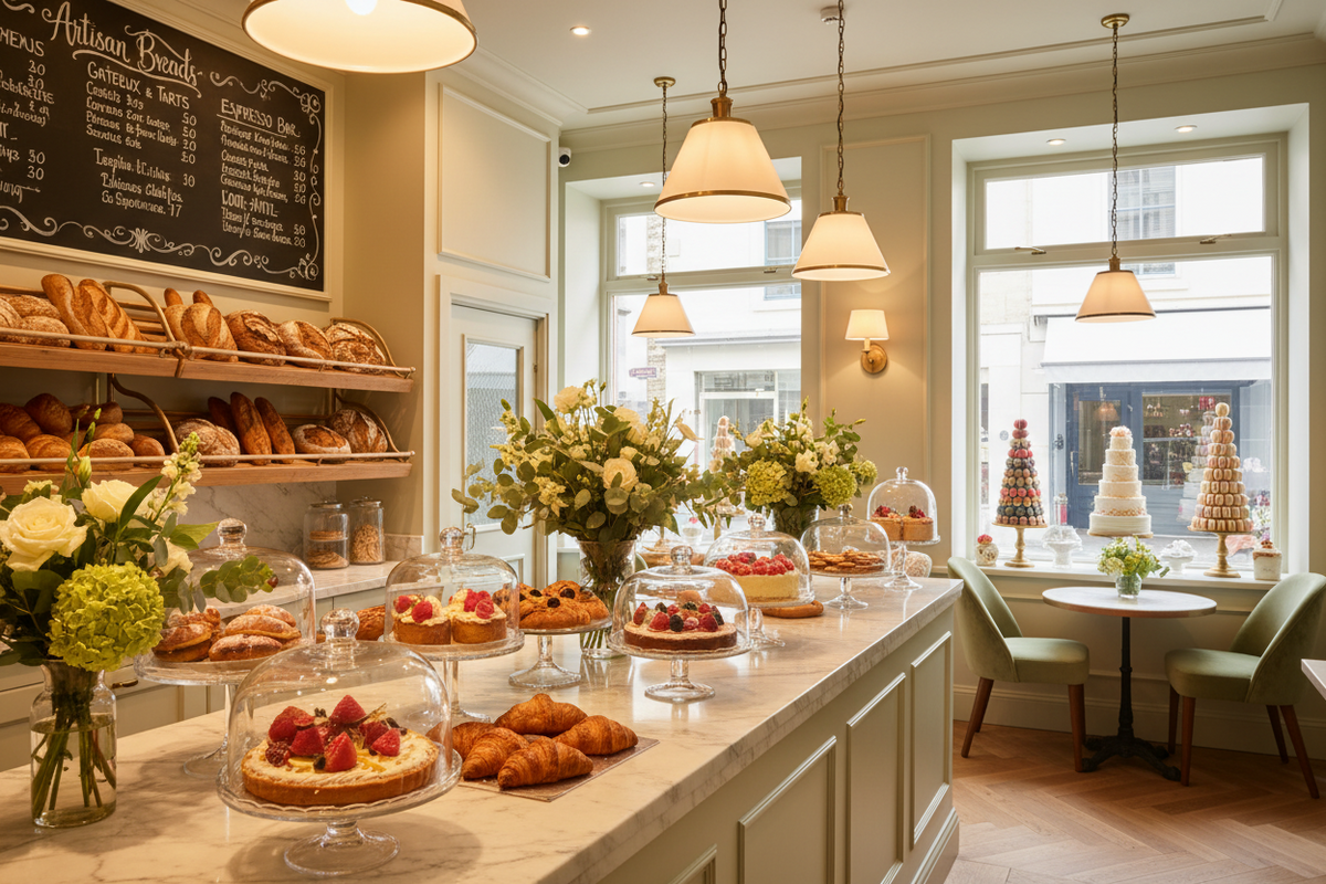
How to design a patisserie or bakery: the complete guide for a space that stages the product
By Mattea, co-founder and Architect — Restylit | LinkedIn
How do you design a patisserie or bakery that sells more? By doing something almost nobody does: treating the product as the main element of the design, not as what gets filled into display cases after the space has been defined. In a patisserie, the product is the space. A mille-feuille under bad lighting looks less appealing. A croissant in an anonymous display doesn't attract. A cake displayed with the right light, in the right case, at the right height: it becomes an object of desire before it's even tasted.
In short: patisseries and bakeries are the food businesses where interior design has the highest return in terms of revenue per square metre. The product is bought primarily with the eyes — the purchase decision happens while looking at the display, not after tasting. Every variable that improves the visual presentation of the product translates directly into higher sales.
What you'll find in this guide. How to design the product display (the most critical variable), technical lighting for the patisserie, the customer path layout, materials that communicate artisan quality, visual identity, costs and the Restylit approach for patisserie and bakery projects.
The Fundamental Principle: The Product Is the Space
In successful patisseries and bakeries, the product isn't something found inside the space: it's the reason the space exists. This distinction completely changes the design approach.
In a poorly designed patisserie, the product is what's left over after everything else has been decided: where the counter goes, where the tables go, what colour the walls are. In a well-designed patisserie, the first decision is where the product is positioned, how it's lit and how the customer sees it. Everything else comes after.
The patisserie customer makes most purchasing decisions by looking at the display, not by reading a menu. This means the display is the main sales tool of the business. And the display is a design choice, not an operational one.
Product Display: The Most Critical Variable
The height of the display cases. Products are purchased primarily with the eyes, and the customer's natural visual field is at 90-160cm height. Display cases that are too low require bending down to see products at the back. Display cases that are too high show products from top to bottom — the least favourable angle for pastry. The optimal height for the main display surface is 90-110cm — at the eye level of a standing customer, with the product seen from the side and slightly from above.
The display sequence. Products aren't positioned randomly in the display cases: they're positioned following a precise commercial logic. The most photogenic and iconic products go in a dominant position, clearly visible from the entrance. They attract attention and immediately communicate the quality level of the patisserie. High-margin products go at eye level, in the zone of maximum visibility. Less expensive or less visually attractive products go on lower levels or in obligatory passing zones.
Refrigerated display vs ambient temperature display. Products requiring refrigeration (creams, mousses, products with fresh cream) must be in refrigerated display cases. Ambient temperature products (croissants, brioches, dry cakes) can be in open displays. The distinction isn't only technical: it's visual. A product displayed in a well-designed case with internal lighting looks more precious than the same product on an open tray on the counter.
The depth of display cases. Patisserie display cases should never be too deep: if the customer can't see the products at the back without leaning over, those products won't sell. The maximum useful depth for a customer-level display is 40-50cm. For vertical displays with multiple shelves, each shelf must be visually accessible from outside.
Lighting: The Variable That Makes Everything Look Better
The lighting of a patisserie is different from that of any other food business. Its main job isn't to create atmosphere: it's to enhance the product, to make it look even better than it already is.
Colour temperature for the patisserie. Baked goods — bread, brioches, croissants, biscuits — are best enhanced by warm amber light at 2700K-3000K. That light brings out the golden tones of the crust, makes products look freshly baked, and creates the visual association with the warmth of the oven. Cold light (4000K or above) makes baked goods look pale and unappetising.
Chocolate pastry and dark products are better enhanced by slightly cooler light, around 3000K, which brings out contrasts. Fresh fruit in pastry products is best shown by high colour rendering light (CRI 90+) that reproduces colours faithfully.
Spot lighting on display cases. The most important light in a patisserie is the one that directly illuminates products in the display cases. Not the general room light, not the ceiling light: the spot light that falls on the product and creates shadow and depth. That depth is what makes a croissant look full and golden rather than flat and anonymous.
Internal lighting in refrigerated display cases. Refrigerated display cases must have internal LED lighting at 2700K-3000K. The cold fluorescent light in old-style refrigerated displays is one of the most frequent mistakes in patisseries: it makes products look greyish instead of vibrant.
Light-shadow contrast. A patisserie with uniform lighting everywhere looks like a supermarket. A patisserie with lit zones (displays, counter, product areas) and zones in semi-darkness (corridors, passing spaces) creates the visual hierarchy that draws the customer toward the product. Contrast sells.
The Layout: How the Customer Moves from Door to Till
The customer path in a patisserie must be designed as a sequence of visual experiences, not as a functional route from point A to point B.
The entrance. The customer must immediately see the best products upon entering. Not the checkout counter, not the shopping bags, not the coffee menu: the product. A well-lit display visible from the entrance is the element that most effectively draws the customer inside and creates the positive first impression.
The path to the till. Ideally, the route from the door to the checkout passes in front of the entire display. The customer who has to walk past the display cases to pay is exposed to more products and makes more unplanned purchases. This is the retail design principle applied to the patisserie.
The waiting zone at the till. During peak hours, customers queue in front of the checkout. That waiting zone must be used to display small, high-impulse products: pralines, chocolates, artisan sweets, petit fours. These are purchases made while looking and waiting.
The seating area (if present). A patisserie with a few tables for eating in must design that zone so it's visually separated from the display area — you don't want seated customers taking up visual space that could be enhancing the product — but close enough to allow the customer to return to the counter for a second purchase.
Materials: Communicating Artisan Quality
The patisserie that communicates artisan quality uses materials with a history visible in their structure. Not smooth and uniform surfaces, but materials with texture, irregularity, warmth.
Wood. Wood is the most effective material for communicating craftsmanship in a patisserie. Raw or naturally finished wooden shelving, counters with solid wood surfaces, exposed wooden shelves: they communicate workshop, tradition, care. Lacquered or veneered wood loses this character.
Natural stone or concrete. Marble or granite worktops, exposed stone walls, a counter with a natural stone top: they communicate solidity and material quality — the same values the customer wants to find in the product. Stone is a material that doesn't lie: if it's beautiful, it's beautiful; if it's quality, you can see it.
Handmade ceramics. Tiles with artisan decorations, majolica cladding, decorative ceramics on the walls: they communicate territory and tradition. A patisserie with artisan tiles on the counter walls or the checkout area immediately has more character than one with generic cladding.
Colours. The palettes that work best in patisseries are those that echo the tones of the products: cream, ivory, beige, light terracotta, sage green, off-white. Vivid and saturated colours can work as accents but not as the dominant palette — they compete with the colours of the products instead of enhancing them.
Visual Identity: Why a Patisserie Must Have a Soul
A patisserie without a precise visual identity is an anonymous patisserie. In a market where there are dozens of patisseries in every city, visual identity is what makes customers choose one over another.
The visual identity of a patisserie isn't the logo on the bag: it's the coherence between the type of products made, the way they're displayed, the materials of the space and the tone of the communication. A high-end French patisserie with complex and precious products must have a space that communicates elegance and rigour. A bakery with artisan bread and rustic products must have a space that communicates simplicity and authenticity. The coherence between product and space is what convinces the customer they're making the right choice.
How Much Does It Cost to Design a Patisserie or Bakery
| Type of business | Total investment | Design cost |
|---|---|---|
| Bakery 30-50sqm | €40,000-80,000 | €4,000-8,000 |
| Patisserie 50-80sqm | €70,000-130,000 | €6,000-12,000 |
| Patisserie with seating 80-120sqm | €120,000-200,000 | €10,000-18,000 |
| Design patisserie 120sqm+ | €200,000-400,000 | €15,000-35,000 |
The item with the greatest impact on revenue is display lighting: an investment of €3,000-8,000 in a dedicated technical lighting system for the products produces an immediate return in conversions.
How Restylit Works on Patisserie and Bakery Projects
The starting point in Restylit projects for patisseries and bakeries is always the product range: what's made, how it's presented, which products you want to enhance most. From that analysis the display design, technical lighting and customer path layout all emerge.
The photorealistic rendering of the lit displays allows the owner to see how their products will look before ordering any equipment. In a sector where visual presentation directly determines sales, that prior vision has direct commercial value.
Are you opening a new patisserie or bakery, or want to renovate an existing one? Contact the Restylit team for a dedicated analysis call on food retail projects. Discover Restylit B2B services →
FAQ
How do you light products in a patisserie to make them look more appetising? The light that best enhances baked goods is 2700K-3000K, warm and amber, which brings out the golden tones of the crust and creates the visual association with the warmth of the oven. The light must be spot and directed at the product, not diffused across the room. The colour rendering index (CRI) must be at least 90 to faithfully reproduce the colours of food. The internal lighting of refrigerated display cases must be LED at 2700K-3000K: cold light makes products look greyish.
At what height should patisserie display cases be? The main display surface must be at 90-110cm height — at the eye level of a standing customer — with the product seen from the side and slightly from above. Display cases that are too low require bending down. Those that are too high show products from top to bottom, the least favourable angle for pastry. The maximum useful depth to see products at the back without leaning is 40-50cm.
Which materials best communicate artisan quality in a patisserie? Natural or raw wood for shelving and counters, natural stone (marble, granite) for worktops, handmade ceramics for counter or wall cladding, concrete for floors. All materials with a visible texture that communicates authenticity and care. Smooth and uniform materials (laminate, polished steel, plastic) communicate industry rather than craftsmanship.
How many display cases does a patisserie need? It depends on the product range and expected sales volume. As a rule of thumb: each displayed product line needs at least 20-30cm of display space to be visible. A patisserie with 30 different product lines needs at least 6-9 linear metres of display. It's better to have fewer products displayed in a visually optimal way than many products crammed together so that none of them stands out.
Restylit is an Italian interior design company, entirely online. We design residential and commercial spaces with photorealistic 3D renderings, shoppable lists and technical drawings for the contractor. Over 500 completed projects, 4.8/5 on Trustpilot.


