

Decorating in Scandinavian Style: What It Really Is and How to Apply It in an Italian (or Any European) Apartment
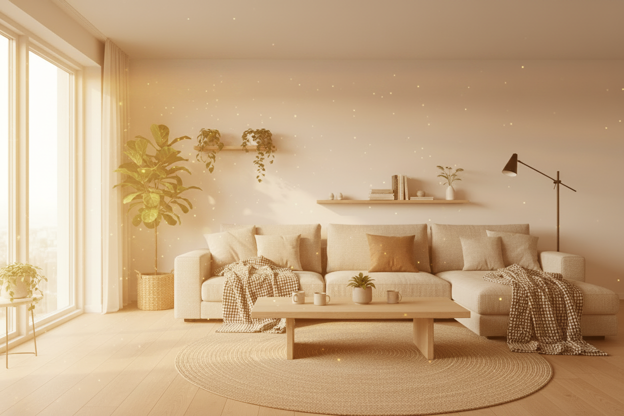
How do you decorate in Scandinavian style? Simple! (just kidding — nothing is ever simple or obvious when it comes to interior design). Anyway, you do it by maximising natural light, using warm materials like light wood and linen, building a neutral palette with very few accents, and following a functional logic that puts practicality before aesthetics. Scandinavian style is not what you see in IKEA catalogues: it's an approach to domestic living born in countries with little sun and long winters, where home has to be a place where you feel good regardless of external conditions.
In short: authentic Scandinavian style has three characteristics that almost no article mentions. The first is that it starts from function, not aesthetics. The second is that it uses colour intentionally, not to fill space but to create contrast. The third is that it ages well because it follows principles, not trends.
What you'll find in this guide. The origins and principles of Scandinavian style, the difference between authentic Nordic and catalogue Nordic, how to adapt it to apartments with their specific characteristics, the right palette and materials, and the most common mistakes made by those who try to replicate it without understanding its logic.
Where Scandinavian Style Comes From and Why It Works
Scandinavian style emerged from a precise necessity: in Nordic countries, natural light hours are very few for many months of the year. Homes have to compensate for this absence through design choices that maximise available light, create visual warmth and make spaces pleasant to live in even during the darkest months.
From this necessity emerge the principles we recognise as characteristic of the style: large windows often without heavy curtains, light colours on walls that reflect light, warm materials like light wood, wool and linen that compensate for cold light, and carefully considered artificial lighting distributed across multiple points.
What has made Scandinavian style so globally influential is that these principles work extremely well outside their original context too. An apartment in London or Paris with little natural light benefits from the same considerations as a Swedish home. An apartment with low ceilings benefits from the same visual techniques that Nordic designers developed to compensate for the lack of light.
The concept of hygge, which in Danish refers to that feeling of warmth, comfort and intimate wellbeing, isn't just a romantic idea: it's a practical philosophy that translates into precise choices about lighting, materials and the organisation of spaces.
The Difference Between Authentic Nordic and Catalogue Nordic
This is the distinction that changes everything, and almost no article makes it clearly enough.
Catalogue Nordic is made of white furniture with light wood legs, terracotta pot plants, motivational quote prints in black frames, and white and grey cushions on every surface. It's a style you can buy in one afternoon and one that dates quickly, too quickly, because it follows a trend rather than expressing principles.
Authentic Nordic is genuinely different.
It has fewer objects, chosen with more care. Authentic Nordic design pieces aren't the ones you find everywhere: they have a history, a reason to be there, and are often made by craftspeople or brands with a precise tradition.
It has more texture and less colour. Authentic Nordic compensates for the simplicity of the palette with a richness of materials. Which ones? Well: raw linen, thick-woven wool, wood with visible grain, irregular ceramics. Sensory complexity replaces chromatic complexity.
The lighting? Designed, not added. Nordic lamps are not decorations — they're tools. Their position, their height, their colour temperature are precise choices that create the hygge atmosphere rather than simply illuminating the ceiling.
Intentional empty space is another very important element. Authentic Nordic spaces have deliberately empty zones. Not because the furniture is missing, but because the empty space is part of the design: it creates breathing room, reduces visual stress and valorises what is there.
How to Adapt It to Your Apartment
Apartments in many European cities have specific characteristics that make adapting Scandinavian style a mission that's not simple at all.
The differences to manage
Apartments in historic city centres often have higher ceilings than Nordic homes. This is an advantage: Scandinavian style, born to compensate for typically compact spaces, expands well vertically.
Natural light in Southern Europe is much more abundant than in Scandinavia for most of the year. This means the light colours used in Nordic style, which in Northern countries serve to reflect the limited available light, can feel excessively bright during the middle of the day in a sunnier climate. It's worth considering slightly more saturated tones or more light-absorbing materials to balance.
The climate in much of Europe requires different solutions for ventilation and materials. The heavy textiles typical of Nordic style, thick wool and velvet, are perfect in winter months but can be uncomfortable in summer. Planning for interchangeable textiles — linen in summer and wool in winter — is the smartest approach.
The similarities to leverage
Italian and wider European design culture shares many points of contact with Nordic design: attention to material quality, appreciation of craftsmanship, preference for objects that last over time. These shared values make the integration between the two much more natural than it might seem.
The Nordic Palette: White Is Not the Only Colour
The most widespread misconception about Scandinavian style is that it's synonymous with total white. It isn't, and understanding this difference is important for an authentic result.
The Nordic palette unfolds across three levels.
The base is a dominant neutral, almost always warm white, warm ivory or very light grey. Not cold plasterboard white: a white with a warm undertone that reflects light without glaring.
The natural tones are almost always the second level: sandy beige, grey, light brown, dove grey. These colours appear in the materials, textiles and wooden furniture. They're not decorative additions but the natural result of the materials chosen.
The accents are used sparingly and intentionally. Moss green, teal, muted terracotta, matte black. No more than two accents per room, used on individual pieces or in small doses in textiles.
The result is not a colourless space: it's a space where every colour has a precise reason to be there.
The Right Materials for Scandinavian Style
| Material | Where it's used | Why it works |
|---|---|---|
| Light wood (ash, pine, birch) | Floors, furniture, details | Visual warmth, reflects light |
| Natural linen | Curtains, cushions, bedspreads | Texture, breathable, ages well |
| Thick-woven wool | Throws, rugs, cushions | Tactile warmth, acoustic absorption |
| Irregular ceramics | Decorative objects, lamps | Visible craftsmanship |
| Matte metal (black, brass) | Details, furniture legs, lighting | Contrast without weight |
| Natural stone or stone effect | Floors, worktops | Connection with nature |
| Transparent glass | Tables, doors, accessories | Visual lightness |
The Most Common Mistakes — They Happen to Everyone!
Too much white, too much emptiness. Authentic Nordic has white but also texture, warm materials and carefully chosen objects. Pure white on every surface without contrasting materials creates a clinical atmosphere, not a Nordic one.
Plants as the only natural element. Plants in Nordic interiors are present but not dominant. The connection with nature happens primarily through materials — wood, stone, wool, linen — not through a large number of pots.
Typographic prints. Prints with phrases in Danish or English on white backgrounds have become a recognisable cliché. Authentic Nordic style uses art with abstract forms, colours or landscapes, not motivational typography.
Ignoring artificial lighting. Scandinavian style without designed lighting doesn't work. Candles, floor lamps with linen shades, pendants in natural materials are as essential as the wall colour.
Using only IKEA. IKEA has democratised the Nordic aesthetic, but IKEA pieces alone produce a result that reads as "IKEA", not necessarily as authentic Nordic. Mixing a well-chosen IKEA piece with higher-quality vintage or artisanal objects is the right strategy.
Want to bring Scandinavian style into your apartment but don't want the catalogue result? At Restylit we often work on exactly this kind of project: defining a version of Nordic style that is genuinely yours, with the right materials and proportions for your specific space. The Basic+3D consultation starts from €249. Book now →
To quickly understand where to start, the Basic consultation (€129, 45-minute video call) is the most direct starting point. Discover the Basic package →
FAQ
What is Scandinavian style in interior design? Scandinavian style is an approach to domestic design developed in Nordic countries, characterised by maximised natural light, warm materials like light wood and natural textiles, a neutral palette with very few accents, and a functional logic that prioritises comfort and practicality. It's not a catalogue aesthetic but a system of design principles born from the necessity of creating spaces that are pleasant to live in climates with little light.
What's the difference between Scandinavian style and japandi? Scandinavian style prioritises comfort and warmth, with soft materials, multiple light sources and a sense of welcome expressed through the concept of hygge. Japandi, a fusion of Japanese and Scandinavian, adds the principle of wabi-sabi — the celebration of imperfection — and tends to have fewer objects, more visual silence and a slightly darker palette. Nordic is warmer and more welcoming; japandi is more contemplative and essential.
What colours are used in Scandinavian style? The Nordic palette is built on a dominant neutral (warm white, very light grey, ivory), the natural tones of the materials (beige, greige, light brown, dove grey) and a maximum of two accents used sparingly (moss green, teal, muted terracotta, matte black). Pure cold white alone is not typically Nordic: it's warm whites and natural textures that create the characteristic atmosphere.
Does Scandinavian style work in a home with a lot of sunlight? It works very well, with some adaptation. Abundant natural light makes maximising light reflection less necessary, so you can work with slightly more saturated tones than classic Nordic. Materials should also be chosen with the climate in mind: lighter textiles like linen are preferable in summer compared to the thick wool typical of Nordic winter interiors.
Restylit is an Italian interior design company, entirely online. Photorealistic 3D renderings, shoppable lists, technical drawings for the contractor. Over 500 completed projects, 4.8/5.


