

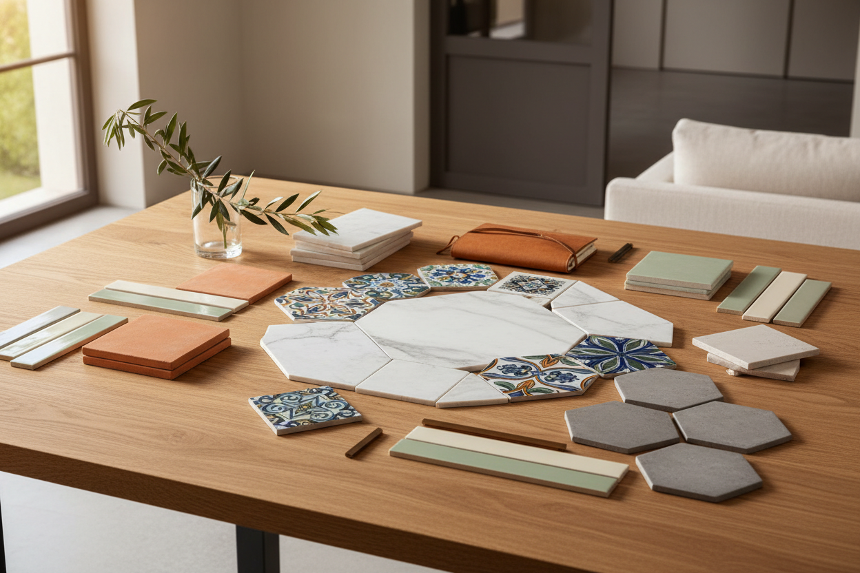
Tiles with personality: how decorative tiles are changing kitchens and bathrooms in 2026
By Mattea, co-founder and Architect — Restylit
How do you use decorative tiles without letting them dominate the whole space? With a precise project that establishes first how much space the decorative tile occupies and how much neutral background it needs to breathe. A decorative tile isn't a background element: it's a feature element. It needs to be treated as such, with the same attention you'd give to an important artwork in an apartment.
In short: tiles with personality — those with geometric patterns, floral motifs, hand-painted designs or complex chromatic variations — are the most sought-after trend in renovation in 2026. But they're also the ones people get wrong most often, because they're bought by looking at a single sample instead of imagining how they'll look applied across ten square metres of wall.
What you'll find in this guide. How to choose a decorative tile in relation to the space, where to position it to maximise impact, how to balance the decorative tile with the neutral materials surrounding it, the formats that work best in 2026, and the installation mistakes that turn a good idea into a chaotic result.
Why Tiles Are Becoming Stars Again
For about ten years, the dominant trend in renovation had been the neutral tile (oh my): cement-effect porcelain stoneware, white marble effect, wood effect. Materials that blend in, that don't draw attention, that let the furniture do the talking.
It was an understandable response to the previous era — the coloured tiles of the 1990s that seemed impossible to get rid of. The pendulum swung toward neutral, and many kitchens and bathrooms of the 2010s became functional environments but ones completely lacking in character.
In 2026 the pendulum has swung back. People have grown tired of neutral spaces with no identity and are looking for tiles that declare something, that have a visual story, that make a space recognisable.
The difference from the 1990s trend is the approach: back then, all surfaces would be tiled in one strong colour. Today decorative tiles are used surgically, on one specific surface, leaving the rest neutral. The result is a focal point instead of an environment that wears you out.
The Tile Types Going Strong in 2026
Hexagonal tiles
The hexagonal format is the one I see most in the inspiration images clients send us. It's not an entirely new concept, but the quality of contemporary production has improved enormously: hand-painted hexagonal ceramic tiles, with colour variations from tile to tile, produce a pictorial mosaic effect that no other format can replicate.
They work best on small surfaces: the floor of a small bathroom, the splashback above the hob, the back of a shower niche. On large surfaces they become oppressive.
Floral and botanical motifs
Ceramic with floral motifs — and in particular productions inspired by Italian majolica and Portuguese azulejos reimagined in a contemporary key — is one of the strongest trends of 2026. Not the kitsch floral of 1980s decoration (imagine if it came back??): contemporary floral with a reduced palette, often in two or three colours on a white or cream background.
The combination that works best: one wall in floral tile, the rest of the space completely neutral. The tile carries all the character needed.
Geometric patterns
Chevron, herringbone, geometric mosaic patterns: these are the most versatile choices because they adapt to more styles. A floor in black and white geometric encaustic tiles works just as well in a classically styled bathroom as in a more contemporary one.
What makes the difference is the scale of the pattern: a small pattern on a large surface becomes confusing. A large pattern on a small surface overwhelms. The proportion between pattern size and surface size is the most critical variable in geometric tiles.
Large-format material-effect tiles
Not all personality tiles have complex patterns. Large-format ceramic slabs with a natural stone effect, with variations in grain and colour from slab to slab, have a material personality quite different from perfectly uniform small-format tiles.
A bathroom wall in 120x280 green marble-effect porcelain doesn't have a decorative pattern, but it has a much stronger visual presence than any neutral tile.
Where to Position the Decorative Tile
This is the most important decision and the one that most determines the success or failure of the intervention.
The kitchen splashback
It's the ideal territory for the decorative tile. It's a small, circumscribed surface, visually important because it's at the centre of attention when you're in the kitchen, and it has the advantage of being surrounded by neutral materials: the worktop, the cabinets, the floor.
A majolica splashback with botanical motifs on a white kitchen is one of the interventions with the best visual impact-to-cost ratio. It requires about 2-3 square metres of tile, even of high quality.
And you can really go to town with it!
The bathroom floor
The floor is the surface where the decorative tile has the most impact because it's the first thing you see when you enter the space. A floor in black and white geometric tiles in a bathroom with white walls is a classic choice that never gets old.
The rule: if the floor is decorative, the walls must be completely neutral. Never decorated above and below at the same time.
The back wall of the shower
The back wall of the shower — the one you see through the glass — is an excellent place for decorative tiles. It's visually protected by the glass, which creates a distance between the observer and the tile and softens its intensity.
Coloured glazed hexagonal tiles on the shower back wall, with the rest of the walls in neutral porcelain, is one of the solutions that produces the most elegant result with the least risk.
The accent wall in kitchen or bathroom
A single wall completely covered with a decorative tile, the other three in neutral porcelain or plaster: it's the safest formula for those who want to use a complex tile without risking saturating the space.
How to Balance the Decorative Tile with the Rest of the Space
The general rule is: the more complex the tile, the more neutral the context needs to be.
A hand-painted majolica with many colours and elaborate motifs needs white surfaces around it, natural wood furniture, no other element competing for attention. The tile is the protagonist: everything else acts as the frame.
A geometric tile in two colours can accept a few more elements: furniture with a slightly more complex finish, brushed brass taps instead of white. But the principle remains: the tile carries the character, everything else amplifies without competing.
The materials that pair best with decorative tiles are those with a natural tactile quality: unlacquered wood, matte ceramic, white marble with fine veining, raw concrete. These materials create a warm context that enhances the tile instead of conflicting with it.
The materials that pair worst are those that bring their own visual complexity: heavily veined marble next to coloured majolica creates conflict. Large-format porcelain with a naturalistic pattern next to a geometric tile generates confusion. The rule is that one of the two must clearly be in the background.
The Format: Which to Choose for Which Space
| Format | Ideal surface | Avoid |
|---|---|---|
| Small (up to 10x10cm) | Splashback, niches, accent surfaces | Large surfaces: becomes confusing |
| Medium (15x15 to 30x30) | Bathroom floor, kitchen splashback | Very large spaces where it gets lost |
| Large (60x60 and above) | Bathroom walls, open space floors | Very small spaces: overwhelming |
| Long and narrow (subway-style) | Vertical splashback, decorative borders | Floors: difficult to lay horizontally |
| Hexagonal | Bathroom floors, shower back accent | Large continuous surfaces |
The Mistakes That Ruin a Good Tile
Decorative tiles on too many surfaces
Decorative floor, decorative walls, decorative splashback: it's the most common mistake and the one with the most negative impact. The decorative tile needs neutral space around it to be perceived as such. Without that contrast, there's no decoration: there's visual noise.
Not considering the laying direction (a serious mistake!)
The laying direction completely changes the perception of the space. The same tiles laid horizontally widen the space. Laid vertically they "raise" it. Laid diagonally they add dynamism. The decision about laying direction must be made before ordering the tiles, not during installation!
The shop sample vs reality
The tile sample you see in a shop under artificial light is different from the same tile applied to a wall with the natural light of your bathroom. Always ask for a sample to take home and look at it in the room for a few days before making the final decision.
Grout in the wrong colour
Grout is often an overlooked element that completely changes the final appearance. White grout on a coloured tile highlights each individual tile. Grey grout on a white tile creates a visual grid that can become dominant. Grout in the same colour as the tile reduces the modular effect and creates continuity. None of the three is wrong in absolute terms, but each produces a very different result.
Ordering the wrong quantity
Decorative tiles with colour variations from batch to batch must all be ordered together, from the same production batch. If you order a supplementary quantity later, the colour might be slightly different and the difference will show in the installation. Always add 10-15% waste to the calculated quantity.
How Restylit Works with Decorative Tiles
Decorative tiles are one of the elements that require the most attention in the design phase because photorealistic rendering makes an enormous difference. Discover the Basic package →
Seeing the majolica on the kitchen splashback in the real context — with that unit, that worktop, that light — before ordering even a single sample: that's the difference between a choice made with certainty and one made with hope.
In Basic+3D consultations we always produce a specific rendering of the tiled area to allow the client to see the overall effect before proceeding with the order.
Are you renovating your kitchen or bathroom and want to understand which decorative tile works in your specific space? The Basic+3D consultation (from €249) includes a photorealistic rendering that shows exactly how that tile will look in that kitchen or bathroom, before ordering anything. Book now →
For a quick comparison of which format and pattern works best for your space, the Basic consultation (€129, 45-minute video call) is the starting point. Discover the Basic package →
FAQ
Which tiles are trending in 2026? The main trends of 2026 are hand-painted hexagonal ceramic tiles, floral and botanical motifs with a reduced palette inspired by Italian majolica and reimagined Portuguese azulejos, black and white geometric patterns, and large-format slabs with material effects like green marble or heavily veined travertine.
How do you use decorative tiles without overloading the space? The main rule is: the more complex the tile, the more neutral the context needs to be. A decorative tile should be used on only one surface per room, leaving the rest completely neutral. The kitchen splashback or the bathroom floor are the ideal surfaces. Never decorate both floor and walls simultaneously with tiles of different character.
How much extra quantity should you order for grout lines and waste? Always add 15% to the calculated quantity for cutting waste and to have spare tiles from the same production batch in case of future breakages. Decorative tiles with colour variations between batches must all be ordered together to guarantee uniformity of the production lot.
Can decorative tiles be used in small spaces too? Yes, and they often work better in small spaces than in large ones. A small bathroom with a geometric tile floor and white walls is a space with a very precise character that doesn't feel small: it feels intentional. The key is not to use patterns that are too large relative to the size of the space: in a small space the pattern must be in scale with the environment.
Restylit is an Italian interior design company, entirely online. Photorealistic 3D renderings, shoppable lists, technical drawings for the contractor. Over 500 completed projects, 4.8/5 on Trustpilot.


