

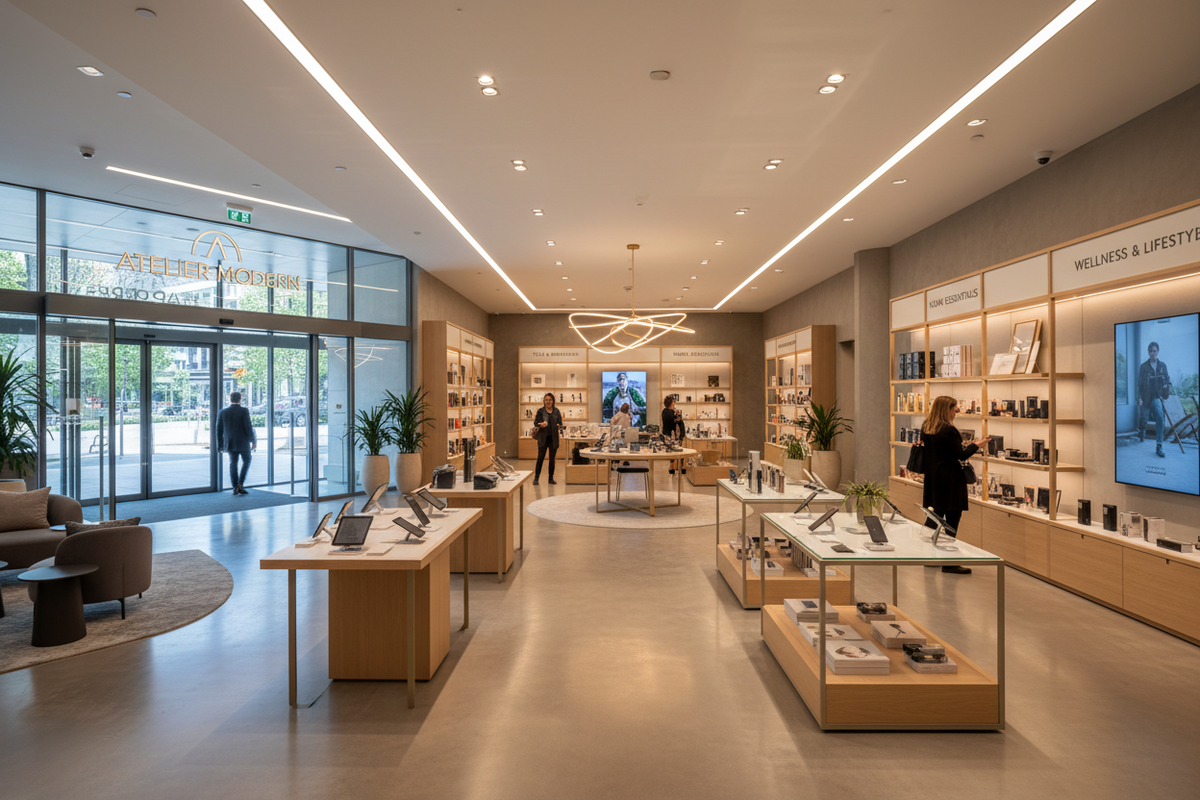
Retail design: how to design a shop that sells more
By Mattea Vincodasesso Perini, co-founder and Architect — Restylit | LinkedIn
What is retail design and why does it determine sales? It's the systematic design of every physical variable in a point of sale: layout, lighting, paths, materials, visual identity — all in service of a precise commercial objective: getting more people in, keeping them longer, and guiding them toward purchase in a natural rather than coercive way. It's not decoration. It's commercial architecture.
In short: according to ISTAT data, in March 2026 retail trade in Italy grew by 3.7% in value. When the physical shop continues to move these volumes, layout becomes a concrete management lever: it influences the time customers dedicate to their visit, the visibility of products and the quality of service. A poorly designed shop doesn't fail because the product is wrong — it fails because the space isn't working for sales.
What you'll find in this guide. How customer psychology works in the point of sale, the design variables that most impact conversions, the types of layout and when to use them, the role of lighting, materials and visual identity in 2026, and how Restylit works on retail design projects.
Why Space Sells Before the Product Does
There's something most shop owners don't consider: the customer decides how they feel in that place within the first 10 seconds of entering, before they've looked at a single product.
Research from the University of Sussex found that when evaluating brands, consumers base their judgement primarily on the feelings the brand evokes and on previous purchase experiences. Only afterwards do quality and product characteristics come into consideration.
Translated into practical terms: if the shop entrance is dark, confusing, overcrowded with displays or cold in atmosphere, the customer registers a negative signal that predisposes them to distrust instead of purchase. That predisposition is almost impossible to recover from with the most beautiful product in the world.
Retail design works on exactly this predisposition. It doesn't seduce: it orients. It doesn't manipulate: it accompanies. A well-designed space makes the customer feel at ease, helps them navigate without effort, and guides them naturally toward the products the shop wants to feature.
The Variables That Most Impact Conversions
Layout and the customer journey
The arrangement of elements is not accidental: every path is studied to guide the customer through strategic areas of the shop. Commercial architecture acts as an invisible direction that accompanies the movement of people.
The customer journey in a shop doesn't get improvised: it gets designed. Three questions guide this design: what should happen in the first 10 seconds from the entrance? What should happen in the first 2 minutes? What is the last touchpoint before purchase?
The answers to these questions determine where product displays go, how corridors are organised, where the counter is positioned and where high-margin products are placed.
The decompression zone at the entrance
Most shoppers make quick decisions at the threshold. The entrance should feel open, readable and welcoming. Avoid overloading the first zone with promotions or dense product displays. Instead, create a decompression area where the customer can get their bearings.
This is the most common mistake in Italian shops: an entrance overcrowded with displays, promotions and communications competing for the customer's attention at the moment when their processing capacity is lowest. The entrance must be clear, readable, with one strong focal element that orients the gaze and introduces the tone of the shop. Everything else comes after.
Dwell time as an indicator
Retailers that implement immersive corners record an average 30% increase in dwell time and an 11% increase in average spend.
Dwell time is the most direct KPI of retail design quality: the longer a customer stays in a shop, the more likely they are to buy. A space that makes people want to explore — with different zones, interesting materials to touch, corners that hold surprises — increases dwell time without needing aggressive promotions.
Lighting as a sales tool
Lighting in a shop doesn't just serve to see the products. It serves to enhance them, create zones of attention, visually separate areas, define atmosphere.
Light at 3000K-3500K best enhances physical products, especially in fashion and food. Spot lighting on key products creates visual hierarchy: it tells the customer "look here first." Soft lighting in browsing zones slows the pace and invites exploration. Cooler light in service and checkout areas signals operational efficiency.
Layout Types: Which to Choose
Grid layout
Parallel rows of displays with regular aisles. Efficient, maximises display surface, facilitates orientation. Works well for shops where the customer knows what they're looking for: supermarkets, hardware stores, pharmacies, automotive parts.
Circuit layout (or loop)
A main path running around the perimeter of the shop, with display zones inside. Forces the customer to pass all the product before reaching the checkout. Increases exposure to unplanned products and average spend. Works for medium-to-large shops where you want to maximise discovery.
Free-flow layout
No imposed path: the customer explores freely. Creates a relaxed atmosphere and invites spontaneous exploration. Works for boutiques, concept stores, niche shops where the experience is worth as much as the product. However it requires very careful acoustic and visual design to avoid becoming chaotic.
Herringbone layout
A central aisle with lateral displays at 45 or 90 degrees. An intermediate solution between grid and free-flow: maintains the orientation guaranteed by the grid with more visual dynamism. Works for small-to-medium sized shops.
Materials and Visual Identity in 2026
The most frequent searches from retailers concern furniture with minimal, vintage or contemporary design, capable of transmitting brand values in a coherent and recognisable way.
The 2026 shop is not the one with the most current style: it's the one with the most precise identity. Materials speak before the product does. A shop with natural wood surfaces, handmade ceramics and textiles communicates craftsmanship and care. A shop with steel, glass and lacquered surfaces communicates technology and precision. A shop with reclaimed materials and raw finishes communicates sustainability and authenticity.
The coherence between materials, colour palette, lighting type and the product being sold is what creates a memorable identity. The shop the customer remembers is the one they return to, recommend, photograph and share.
How Restylit Works on Retail Design Projects
The starting point in Restylit's retail projects is always the analysis of the brand and the target customer: who enters this shop, what they expect to find, how they should feel from entrance to checkout. From that analysis the design direction emerges.
The photorealistic rendering of the shop — entrance, main display zone, sales counter — allows the owner to see how the space will function before commissioning furnishings or works. In a sector where a wrong display unit can cost €5,000-10,000 and can't be returned, that prior vision is worth an enormous amount.
Are you opening a new shop or renewing an existing one and want to understand how to design the space to maximise conversions? Contact the Restylit team for a dedicated analysis call on retail design projects. Discover Restylit B2B services →
FAQ
What is retail design? Retail design is the systematic design of all physical elements of a point of sale — layout, lighting, paths, materials, visual identity — in service of the shop's commercial objectives. It's not furnishing: it's commercial architecture that guides customer behaviour, increases dwell time and maximises conversions.
Which layout is best for a shop? It depends on the type of shop and the purchasing behaviour of the target customer. The grid layout works where the customer knows what they're looking for. The circuit layout maximises exposure to unplanned products. The free-flow layout creates an exploration experience for boutiques and concept stores. There is no universally better layout: there is the one most suited to the specific business model.
How much does shop design impact sales? Available data indicates a 30% increase in dwell time in shops with experiential design, and an 11% increase in average spend. Dwell time is the most direct KPI: every additional minute a customer spends in a shop increases the likelihood and value of purchase.
How much does a retail design project cost for a shop? The project cost varies based on floor area and complexity. For a shop of 50-100sqm, a project with photorealistic renderings and technical specifications sits between €3,000 and €8,000. The project represents 5-10% of the total fit-out cost and is what avoids the most expensive mistakes: wrong display units, a layout that doesn't work, inadequate lighting.
Restylit is an Italian interior design company, entirely online. We design residential and commercial spaces with photorealistic 3D renderings, shoppable lists and technical drawings for the contractor. Over 500 completed projects, 4.8/5 on Trustpilot.


