

Shop layout: how to organise space to guide customers and increase conversions
By Mattea Vincodasesso Perini, co-founder — Restylit | LinkedIn
How do you organise the layout of a shop that works? First of all, starting from the customer, not the product. The question isn't "where do I put all the merchandise?" but "how do I want the customer to move through this space and what should they see at every moment of their journey?" These are two very different questions that produce equally different layouts.
In short: layout works in silence. When it works, the customer navigates almost without realising it: they understand where to start, what to compare, where to find help and where to complete the purchase. When it works poorly, the shop demands extra effort at every step. That extra effort translates into frustration, reduced dwell time and falling conversions.
What you'll find in this guide. The layout rules that most impact customer behaviour, managing the entrance and decompression zone, how to position strategic products, the role of guided vs free paths, the most common mistakes and how all of this translates into a concrete project.
The First Rule: The Customer Doesn't Read the Shop the Way You Want Them To
The customer enters a shop with a low level of attention and gets their bearings in a few seconds based on immediate visual signals. They don't read the labels, they don't follow the arrows on the floor, they don't stop to understand the logic of the shelves. They perceive the atmosphere, identify zones of interest and move toward whatever captures their attention.
The layout must work with this, not against it. It must not require interpretation: it must be intuitive. It must not guide with explicit commands: it must guide with visual signals, natural paths, well-positioned focal points.
The difference between a layout that guides and one that confuses is measured in concrete behaviours: how long the customer spends in the shop, how many zones they visit, how many products they touch, how many unplanned purchases they make.
The Entrance: The First 10 Seconds Determine Everything
Most shoppers make quick decisions at the threshold. The entrance should feel open, readable and welcoming. Avoid overloading the first zone with promotions or dense product displays. Instead, create a decompression area where the customer can get their bearings.
The decompression zone is the space immediately after the entrance — generally the first 1.5-2 metres — which must be empty or nearly so. No shelves, no display units, no communications. One focal element that introduces the tone of the shop and orients the gaze toward the interior.
This goes against the instinct of many owners, who want to maximise display surface from the entrance. But research on customer behaviour consistently documents that products positioned in the decompression zone are seen less than those positioned a metre further in, because the customer is still in "orientation" mode and not in "purchase" mode.
What to do at the entrance:
One single strong visual impact element — an installation, a seasonal product displayed with care, a brand image. Slightly higher light than the rest of the shop to create a welcome effect. Clear floor that allows you to see where to go. And scent, if coherent with the brand — not a generic air freshener: a chosen and calibrated fragrance that becomes part of the shop's identity.
The Path: How Customers Move
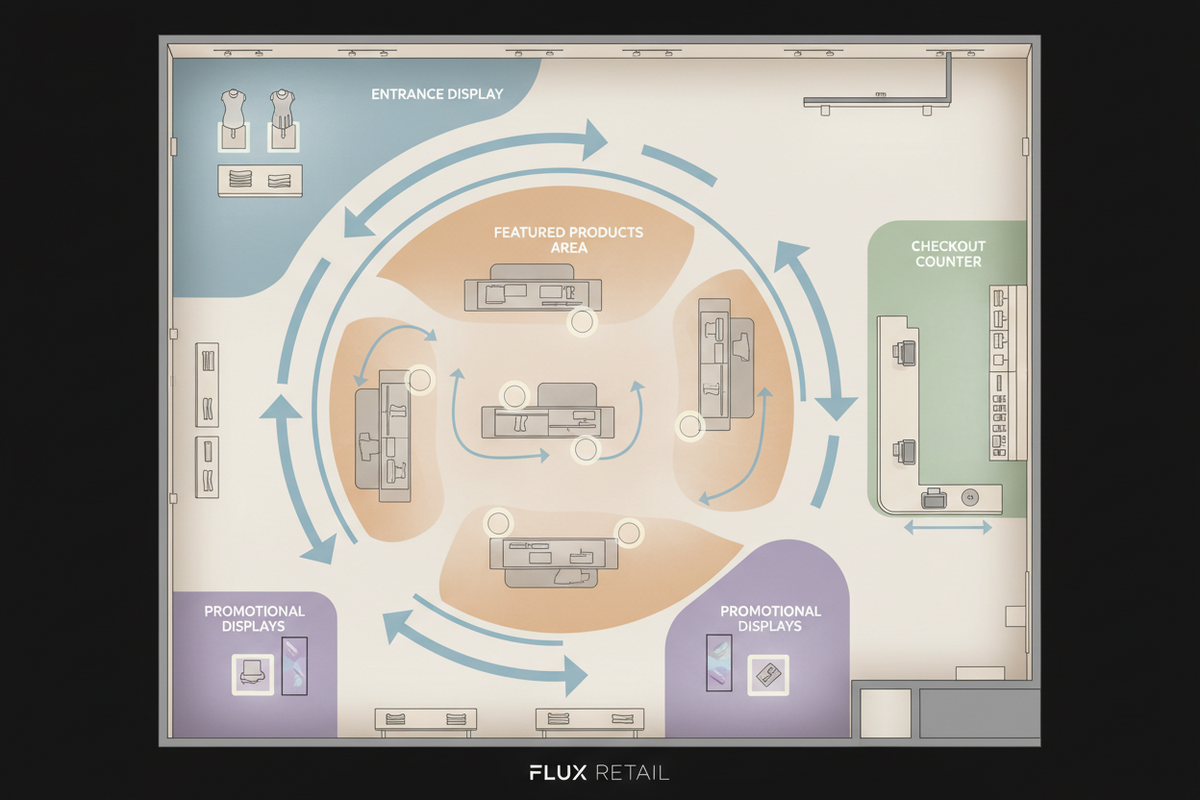
Most customers, when entering a shop, instinctively move right and then follow the perimeter of the space. This pattern is documented in decades of consumer behaviour research and occurs regardless of culture or age.
The layout must account for this pattern instead of ignoring it. The most important products — those with high margins, those you want to highlight, those that best represent the brand identity — go along the natural path, not at the back of the shop where only those actively searching for something will reach.
The three types of path:
Guided path: a clear main aisle with lateral displays. The customer knows where to go, orientation is immediate, traversal time is predictable. Works for shops with a wide offer and customers with little time.
Free path: no imposed aisle, the customer explores. Requires very careful design to avoid becoming confusing, but produces the greatest engagement and the highest rate of unplanned purchase. Works for boutiques and concept stores where the discovery experience is part of the value.
Mixed path: a clear main path with lateral exploration zones. It's the most versatile solution for most medium-sized shops.
Product Positioning: Visual Hierarchy
Not all products carry the same strategic weight. The layout must reflect this hierarchy instead of displaying everything at the same level.
Locomotive products: those that attract the customer into the shop, often well-known and actively searched for. They go at the back or in zones that require crossing the shop to reach them, maximising exposure to other products along the way.
High-margin products: those you want to sell most because they generate the greatest profit. They go at eye level, in the natural visual field of the customer, in the zones with the greatest footfall.
Impulse products: those not searched for but bought when seen. They go in waiting zones (near the checkout, in queues) and at unavoidable passing points.
Complementary products: those that sell well in combination with others. They go displayed near the main products they complete, not in a separate section.
The Most Frequent Layout Mistakes
The overcrowded entrance
Already said, but worth repeating: the decompression zone must be clear. Every display element in the entrance reduces conversions on products positioned there and worsens the first impression of the shop.
The dead-end aisle
A path that ends against a wall or display unit with no visible exit creates a sense of entrapment that produces discomfort and accelerates exit from the shop. Every path must have a clear prospect — a focal point at the end, a recognisable zone to move toward.
Everything at the same height
A display that presents all products at the same level — all hung at the same height, all in a horizontal row — has no visual hierarchy. The customer doesn't know what to look at first. Alternating heights, using plinths for key products, varying the distance from the eye creates the visual rhythm that orients attention.
The shop that can't be seen from outside
The window is the first layout: it decides whether the customer enters or passes by. An overcrowded window communicates a chaotic shop. A window with a few well-chosen elements, carefully lit, communicates quality and invites entry.
How to Design a Layout: The Process
First step: define the ideal customer journey. From the moment the customer enters to when they leave, what should they see, in what order, and where should the purchase decision happen.
Second step: translate intentions into a floor plan. Position the functional blocks — main display zone, complementary display zone, checkout, any resting areas — respecting natural movement flows.
Third step: verify the layout with a photorealistic rendering. Seeing how the customer will move through the shop, with that light and those materials, before ordering the furnishings or starting works: that's the difference between a certain decision and a hope.
Are you opening a shop and want to understand how to organise the layout to maximise conversions? Contact the Restylit team for a dedicated analysis call on retail design projects. Discover Restylit B2B services →
FAQ
What is the minimum aisle width in a shop? The minimum comfortable clearance in a shop is 90 centimetres, allowing one person to pass. For a shop with medium-to-high footfall, the main aisle should be at least 120-150 centimetres to allow two customers to pass each other without discomfort. Aisles under 90 centimetres create a sense of claustrophobia that accelerates exit from the shop.
Where should the checkout be positioned in a shop? The checkout should never be near the entrance, where it would intercept customers before they've visited the shop. It goes at the back or to one side, so that reaching it requires crossing the shop and therefore being exposed to more products. The checkout area is also the impulse products zone: small, economical, high-visibility items bought on impulse while waiting to pay.
How do you manage a shop window? The window is the first customer touchpoint: it decides whether they enter or pass by. It must be updated every 3-4 weeks to maintain the interest of regular passers-by. It must display very few products — 3-5 at most — well lit with a clear visual theme. Overcrowding the window with products communicates a chaotic shop rather than one rich in choice.
What is the decompression zone in a shop? It's the space immediately after the entrance — approximately the first 1.5-2 metres — which must be empty or nearly so. The customer entering a shop is still in orientation mode and not purchase mode: products positioned in this zone are seen less than those immediately further in. The decompression zone must have one single strong focal element that orients the gaze toward the interior of the shop.
Restylit is an Italian interior design company, entirely online. We design residential and commercial spaces with photorealistic 3D renderings, shoppable lists and technical drawings for the contractor. Over 500 completed projects, 4.8/5 on Trustpilot.


