

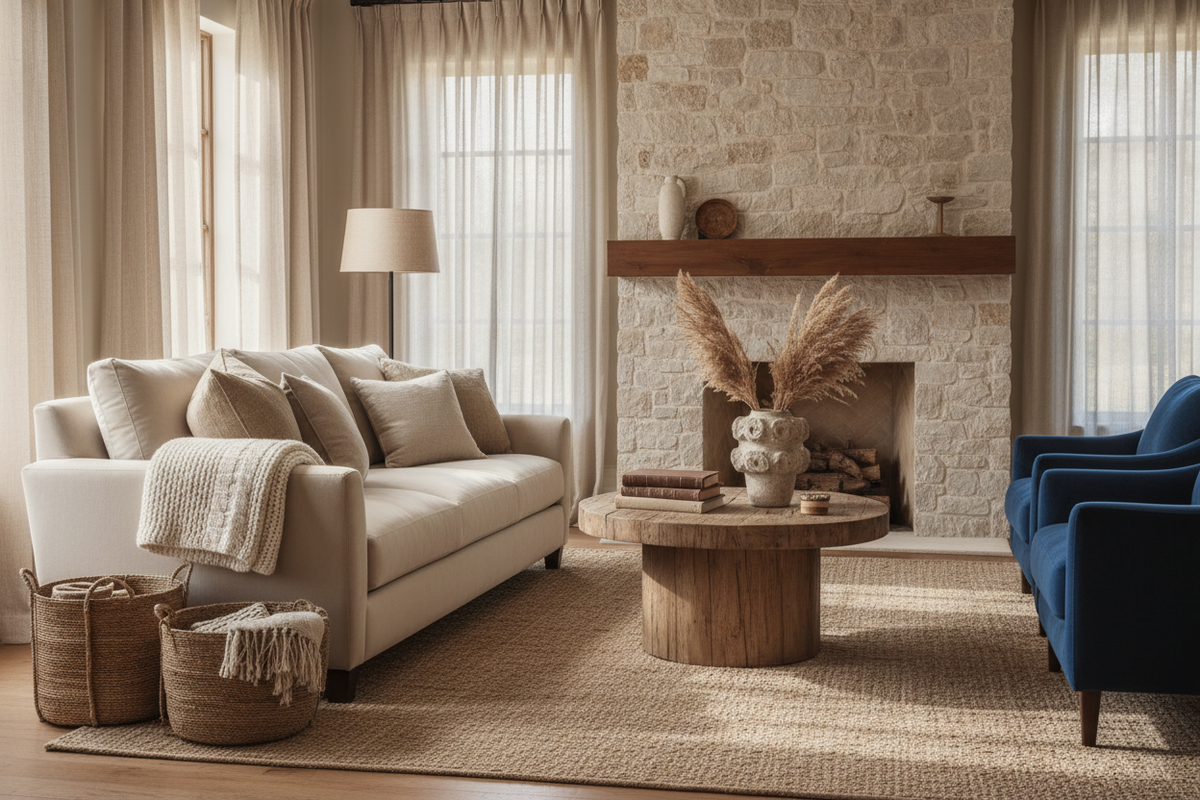
The tactile home: why in 2026 texture has replaced colour
What is the tactile home? It's an approach to interior design in which the sensory depth of spaces is built through variety of texture and materials rather than variety of colours. It's not an aesthetic: it's a paradigm shift in the way domestic spaces are designed and perceived. A tactile home can be almost monochromatic and yet visually rich, because the complexity comes from the materials instead of the palette.
In short: in 2026 texture has replaced colour as the main language of residential design. Not because colour has gone out of fashion, but because people have understood — often through direct experience — that a room with many different colours tires more quickly than one with a single colour but many different textures. Sensory richness doesn't come from the quantity of visual stimuli, but from their quality.
What you'll find in this guide. Why texture has replaced colour, how to build a tactile home in practice, the materials dominating 2026, how to combine textures without creating visual chaos, and why this approach produces spaces that age much better than those built on elaborate colour palettes.
How I Understood Something Had Changed
There was a precise moment when I understood that the way people think about interiors was changing.
I was looking at the inspiration images a client had sent us for her living room. There were about twenty photos she'd saved on Pinterest over the past six months. And as I looked at them, I noticed something strange: the palette was almost identical in all of them. Beige, warm white, greige, a touch of brown here and there. Very little colour.
But the rooms were all different, and all beautiful. The difference was in the materials. A Berber rug in raw wool, a bookcase in wood with very visible grain, a sofa in long-pile bouclé, an irregular ceramic vase, a thick-weave cashmere throw, curtains in untreated linen with the imperfections of the fabric still showing.
It wasn't the palette that made those rooms interesting. It was the tactile complexity. You could sense that those surfaces felt different from each other when touched, and that difference created a richness that no colour combination could have replicated.
From that moment, perhaps, I started looking at projects differently.
Why Texture Works Better Than Colour
This is the thing that surprised me most when I started studying this topic more systematically.
Colours are processed primarily through the visual cortex. They're direct, immediate stimuli that capture attention and hold it. But for exactly that reason, they tire. A highly saturated colour or a combination of many different colours requires a continuous processing effort that, over time, generates that sense of too much which leads to wanting to change everything after two years.
Textures, on the other hand, activate both the visual system and the somatosensory system — the one connected to touch. The brain processes surfaces not only as visual information but also as anticipated tactile information, based on accumulated experience. A raw wool fabric is anticipated by touch before you even feel it. A raw concrete surface communicates coolness and weight before the hand has touched it.
This double activation — visual and tactile — produces a richer and less tiring response. The complexity is processed at a deeper and less conscious level, which means it's perceived as enrichment rather than overcrowding.
In practical terms: a space with many different textures but a reduced palette feels rich without tiring. A space with many different colours but few textures feels rich and tiring at the same time.
The Materials Dominating 2026
Data from reference platforms for high-level design show a significant increase in demand for specific materials and surfaces in 2026. It's not a casual aesthetic trend: it's the market's response to a precise demand for authenticity and sensory depth.
Bouclé
The fabric with curly, irregular pile that Coco Chanel made famous in the 1950s has returned to being the most sought-after material for sofas and armchairs — did you know that? Not out of nostalgia, but because bouclé does exactly what a tactile home needs: it brings visual and tactile texture simultaneously, ages well, and is warm to the eye and to the touch.
Wood with visible grain
Lacquered and veneered wood dominated the 2000s and 2010s because the smooth surface was associated with the concept of visual cleanliness. In 2026 the trend reverses: solid wood or naturally finished wood that leaves the grain visible and the material's texture exposed is what people are looking for. Not because smooth isn't beautiful, but because wood with visible texture carries a depth that lacquered wood simply doesn't have.
Handmade ceramics
Perfectly uniform industrial ceramics are giving way to pieces with visible imperfections, irregular edges, colour variations in the material. It's not a return to the rustic — it's the valorisation of craftsmanship as a sign of authenticity. A vase with a small irregularity in the rim tells you it was made by a person, not a machine.
Untreated linen
Raw linen, with its rough texture and natural colours ranging from beige to grey, is the textile that best represents the tactile home aesthetic. It's not soft like silk or cotton — it's rough, slightly stiff when new, full of small irregularities in the weave. And that's exactly why it's perfect: it brings visual and tactile texture in an authentic way.
Travertine and natural stone
Natural stones with visible porosity, travertine with its characteristic holes, marble with irregular veining, limestone with its imperfections: these are the materials that more than any other represent texture in architecture. Not as ostentatious luxury but as material with a history visible in its very structure.
How to Build a Tactile Home in Practice
The tactile home isn't a room with all possible materials piled together. It's a room in which textures are chosen and combined with the same logic you'd use to combine colours.
The rule of three textures
As with colours, the basic rule is not to exceed three or four dominant textures in the same environment. A smooth texture as a base (the floor, the walls, the ceiling), a medium texture (a textile, a wooden piece of furniture), a thick or irregular texture (a wool rug, a wicker basket, a handmade ceramic).
Three textures that speak to each other create depth. Seven different textures that accumulate create confusion, even if every individual piece is beautiful.
Contrast as a tool
Textures work best in contrast with each other. A smooth, cool surface like marble is even more beautiful next to a rough, warm textile like linen. A piece of furniture in wood with visible grain acquires character next to a bare plaster wall. A bouclé sofa with irregular pile feels richer on a smooth porcelain floor.
Contrast isn't opposition: it's dialogue. Two surfaces that complete each other instead of competing.
The palette as unifier
When textures are many and varied, the palette must be reduced. This is the fundamental principle of the tactile home: the complexity comes from the materials, not from the colours. An environment with many different textures but all in tones of beige, warm white and greige works perfectly visually. The same environment with many different textures and many different colours becomes chaotic.
The neutral palette isn't a safe choice: it's what allows textures to express themselves without competing with colour.
Why Does the Tactile Home Age Better?
This is perhaps the most practical reason why the tactile approach is replacing the chromatic one.
A room built on an elaborate colour palette — many different colours combined with care — ages following the trends. The green that seemed perfect in 2022 can seem dated in 2026. The terracotta that dominated in 2020 is now immediately recognisable as "that style."
A room built on materials with natural texture and a neutral palette ages with time instead of against it. The wood with visible grain, the raw wool of the rug, the linen of the curtains: these materials acquire character with use instead of degrading. They become more beautiful, not more dated.
This is the difference between a style and a material. Style follows trends. A material has a life of its own that transcends trends.
The Connection with the Unplugged Home
There is a precise connection between the tactile home and the unplugged room theme we covered in a dedicated article.
Natural textures — wood, wool, linen, stone — measurably reduce cortisol levels thanks to the principle of biophilia. It's not aesthetics: it's physiology. Visual and tactile contact with natural materials activates the parasympathetic system — the one associated with relaxation and recovery.
A tactile home, built on natural materials with visible texture, is functionally more relaxing than one built on smooth, plastic and uniform surfaces. Wellbeing isn't a side effect of design: it's the result of precise design choices.
Are you rethinking the furnishings of your home and want to build a tactilely rich space without falling into visual chaos? The Basic+3D consultation (from €249) includes the specification of the right materials for your space, with a photorealistic rendering that shows how they'll sit together before you buy anything. Book now →
To quickly understand which materials work in your specific space, the Basic consultation (€129, 45-minute video call) is the most direct starting point. Discover the Basic package →
FAQ
What is the tactile home in interior design? The tactile home is a design approach in which the sensory depth of spaces is built through variety of texture and materials rather than variety of colours. A tactile home can have an almost monochromatic palette and yet be visually very rich, thanks to the combination of materials with different tactile characters: raw wood, wool, linen, handmade ceramics, natural stone.
Which materials define the tactile home in 2026? The dominant materials in 2026 are bouclé for upholstered textiles, solid or naturally finished wood that leaves the grain visible, handmade ceramics with visible imperfections, raw linen for curtains and cushions, and travertine and natural stone for surfaces. All share one characteristic: the surface is neither uniform nor perfect, but carries the trace of the natural or artisan process that produced it.
How do you combine textures without creating visual chaos? The basic rule is not to exceed three or four dominant textures in the same environment, and to reduce the colour palette when textures are many and varied. Contrast between textures works as a design tool: a smooth, cool surface acquires character next to a rough, warm one. The neutral palette is what allows textures to express themselves without competing with colour.
Why does the tactile home age better than one built on colours? A room built on trend colours ages following the trends: the colour that seemed perfect today can seem dated in three years. A room built on natural materials with authentic texture ages with time instead of against it. Wood with use acquires patina. Wool with time softens. Linen washed many times becomes more beautiful. These materials have a life of their own that transcends trends.
Restylit is an Italian interior design company, entirely online. Photorealistic 3D renderings, shoppable lists, technical drawings for the contractor. Over 500 completed projects, 4.8/5 on Trustpilot.


